I don't often see a house in Calgary that looks like anything I could move right into and not want to change too much. Usually decor here heavily favors prairie neutrals and "showhome" bland semi-modern furnishings and decor. For those wheeling and dealing in the higher end of the market I do see renovated properties that are more minimalist, modern or heavily traditional than I would ever choose, and missing from Calgary's repertoire seems to be anything that falls in the boho/eclectic/modern country/farmhouse/beachhouse/granny chic styles that I love. That's not to say they don't exist... they are just NEVER for sale.
I was completely surprised by this property today as I was perusing, for fun (read: killing time at work), hot listings for sale in Calgary these days. This newly renovated little number totally caught my eye and stood out among the hundreds of other beige and boring homes for sale. There are definitely things I don't love about it (its overly staged facade for example) but plenty of things I do. Like for instance, I do adore the white kitchen w/ butcher block countertops, herringbone tiled floor that looks eerily similar to what we just installed in our bathroom, white paneling and beadboard wainscoting throughout, mainfloor laundry, and its charming curbside presence.
Too bad we're not actually in the market or I'd be seriously tempted by this one.
Saturday, May 22, 2010
Tuesday, May 18, 2010
Flowering Branches Inside
You know when you buy something that catches your eye, but then you bring it home and it kind of sits around and never really finds a home or fills a use? I purchased a heavy blue vase a couple years ago that has since sat in my living room, half-heartedly holding some Chinese paper umbrellas, or even empty but has never really found a proper place in our home. It’s size was always too awkward for most things I wanted it for… too big or too small, never quite right. I thought about getting rid of it at a recent garage sale we had, except for that I actually quite like it, and was holding out hope that one day inspiration would hit, and I'd figure out what to do with it.
Well today was that day!
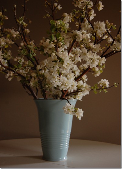
I did a little pruning off the poor old apple tree in our yard, and not wanting to discard the gorgeous flowering branches I had trimmed (yes not exactly the right time to be pruning... I know!), I remembered my old blue vase sitting forlornly in a corner of the living room.
It was exactly the perfect container for the heavy, blossom-laden branches, and I have to say it looks quite stunning in my house. To me, there is hardly a thing more beautiful than a flowering tree, and so to have this lovely bouquet in my home, with its sweet fragrance and tender blooms is like spring on the inside too.

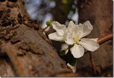
Blossoms on the tree


Well today was that day!
I did a little pruning off the poor old apple tree in our yard, and not wanting to discard the gorgeous flowering branches I had trimmed (yes not exactly the right time to be pruning... I know!), I remembered my old blue vase sitting forlornly in a corner of the living room.
It was exactly the perfect container for the heavy, blossom-laden branches, and I have to say it looks quite stunning in my house. To me, there is hardly a thing more beautiful than a flowering tree, and so to have this lovely bouquet in my home, with its sweet fragrance and tender blooms is like spring on the inside too.

Blossoms on the tree


Monday, March 15, 2010
What a wonderful world.
I know maps are really hot in decor right now and I can't get enough them (even though I usually hate anything trendy on principal). Here are two worldly items I want for myself.
Photo from Vintage Renaissance
A New Continent shower curtain from Anthropologie
This is one of the contenders for the new bathroom shower curtain. I think the Geek would like it better than the other options I have had my eye on, most of which include a lot of feminine qualities, like layers of ruffles. What he'll really like most however, is that it is on sale!
Thursday, March 11, 2010
Getting there... slowly!
I can't believe there are still some things left to do in the bathroom. The most important of which is to get the door hung. Bathroom are pretty useless places when they don't have a door.
Also still to do:
Hang the cabinet
Install light fixture
Lower mirror (to make room for light fixture. Oops.)
Hang shelf under mirror
Finally decide on a new shower curtain.
Frame and hang the art
Buy new hardware for vanity/cabinets
I can't wait till these little things are done, which will really transform a nicely renovated bathroom into the vintage-spa I've been dreaming about.
In the meantime here are some "in-progress" photos I haven't posted yet.
Wednesday, March 10, 2010
Lucky for sure.
I will always have a soft spot for weddings. Especially gorgeous ones.
This one took my breath away. It is the wedding of Eunice and Daniel and was featured in the new spring issue of Martha Stewart Weddings magazine. Eunice is the creative director of Hello!Lucky, one of my favorite stationers, so no wonder everything about this wedding was amazingly artistic, beautiful and a little bit quirky. You can also check out some photos on 100 Layer Cake's wedding blog.
Don't worry, I'll wait while you check those out.
Oh, I see you're back and swooning like I was over that dress and those details. Between the stage and the puppets and the photobooth and the reception tent and drink tables, and seating chart (Oh! That seating chart!!), I think the lucky guests must have had just an incredibly fun and memorable time.
And that beautiful bride and groom? The day of a lifetime.
Monday, February 22, 2010
Etsy love - Alberto Cerriteno
The Geek and I have been drooling over the amazing art by Portland artist, Alberto Cerriteno. For Christmas, I purchased this print, from the Etsy shop, that I thought might look good hung in his office area.
The more I look at it however, the more I think that the bathroom is where he might end up. This little guy looks pretty at home in there.
Thursday, February 18, 2010
Bathroom sneak-peek.
New cabinet
Our contractor found some extra space in the wall and so we had a recessed cabinet made to match our vanity! It's not exactly where I would have loved to have it (middle of the wall opposite the vanity), but in a 5 x 8 bathroom, where space is already at a premium, we'll take it!
Herringbone tiled floor before grouting
In my dream bathroom, I would have hex tile. However, it was not going to work in this bathroom for several reasons, so we did my next favorite thing... herringbone! We had our tiler cut down our 12 x 24 tiles into 6 x 24 to make the pattern more obvious in a small space. I love how it turned out, and I really love the radiant heating I had installed as a surprise for The Geek's birthday.
New vanity with Carrara marble top and satin nickel fixtures
Our vanity was a steal. I got it brand new off of Kijiji for $150. The marble vanity top with undermount sink was on sale at Home Depot, and while I love the look of a vessel sink, we decided to be more practical for our family bathroom. The Geek really loved these Ashfield widespread fixtures by Pfister, and although I really wanted a more traditional cross-handled faucet, I do like the vintage farmhouse charm of these ones. We also purchased the tub/shower combo fixtures to match.
3 x 6 white subway tile, glass mosaic accent and new window
I am so happy with the new tile! The mosaic tile is a blend of glass and carrara marble, but I made a major mistake when it came to the grouting. These photos are pre-grout, and while I did want a dark grout for easier maintenance, and to define the subway tile more, I didn't remember that the grout lines would be around every single little square in the mosaic. Unfortunately this darkened up the accent tile, which I will show in later photos, and while it still looks fantastic, it's not quite what I had in mind. Live and learn I guess!
Subscribe to:
Comments (Atom)


